At Bloom Intelligence, we strive to provide your growing company with the analytics and tools it needs to successfully attract and retain a solid, enduring customer base. Our polished and user-friendly suite of software tools -- which capitalizes on the ubiquity of wi-fi -- allows you to focus your efforts and derive the highest return on your invested marketing dollar. To that end, allow us to introduce our Bloom Intelligence Dashboard -- the general layout, and then a review of the four key Footfall metrics that it boasts.
The Layout
The dashboard is designed in a user-friendly, compact set up: on the left-hand side of the interface is the overview with an expandable menu scheme, and a modifiable date header lets you select the desired range for analysis. A Locations display toolbar is available for you to easily access your different business regions or individual stores. The content is divided into three primary Metric sections: Footfall Metrics (discussed below), Customer & Loyalty Metrics, and Engagement Metrics.
Average Daily Traffic
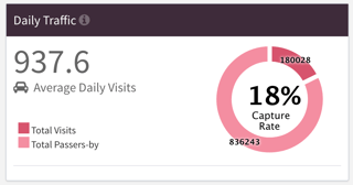 This metric sums the total number of daily visitors to your business. It also tracks the total number of people that passed by, which then provides you with a capture rate percentage (total visits divided by the total number of people possible). The dashboard displays this percentage along with the percentage increase (hopefully!) over the previous day.
Average Daily First Time Visitors
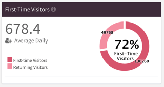
With this handy tool, you can quickly see what percentage of new potential customers (visitors) you had for the day. The dashboard divides the new visitors by the total number of visitors, providing you with a "new visitor" percentage. As with the Average Daily Traffic section, a percentage increase (or decrease) from the day before is illustrated.
Average Dwell Time
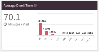 For this number, the dashboard clues you in to how long your customers are staying connected. A visually appealing bar graph provides a breakdown of how long your different customers remained logged into your Wi-Fi hot spot.
Popular Visit Times
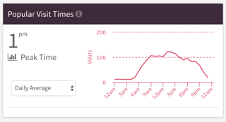 At a quick glance, this can illustrate when your peak business times are -- which is invaluable for staffing and planning purposes. Your peak time is prominently displayed, and this graph allows for a rapid visual scanning of the ebbs and flows of your customer base.
These four Footfall metrics give you valuable insight into how many average customers you have, the number of those customers that are first-time visitors, how long they stayed, and when your peak business times are. Stay tuned for the second installment of the Bloom Intelligence Dashboard intro, where we delve into the Customer and Loyalty Metrics!


 This metric sums the total number of daily visitors to your business. It also tracks the total number of people that passed by, which then provides you with a capture rate percentage (total visits divided by the total number of people possible). The dashboard displays this percentage along with the percentage increase (hopefully!) over the previous day.
 For this number, the dashboard clues you in to how long your customers are staying connected. A visually appealing bar graph provides a breakdown of how long your different customers remained logged into your Wi-Fi hot spot.
 At a quick glance, this can illustrate when your peak business times are -- which is invaluable for staffing and planning purposes. Your peak time is prominently displayed, and this graph allows for a rapid visual scanning of the ebbs and flows of your customer base.


.svg "group-24 (1)")
